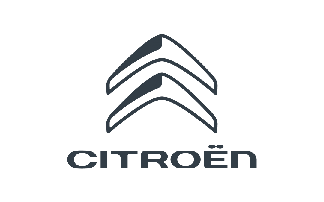
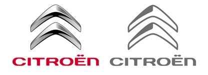
We are happy to share with you that during this quarter, Automobiles Citroën has introduced a new logo. To quote from the style guide:
“…In the context of deploying its new brand positioning, Citroën has modified the 2D version of its logo. The 3D version remains the same. The new style of graphics is purer, simpler and more direct, designed to increase the brand’s visibility and impact. This choice of graphics is in line with the current ‘flat design’ trend of simplifying signs. As such, the 2D Bloc Marque uses just one colour…”
After about three decades, the red color has now disappeared from the logo (the last one had been introduced in 2009).
Next to the new logo, a new tagline “Inspired by you” is now replacing the old claim “Créative Technologie” which now became obsolete.
A campaign has been launched:
www.citroen.com/en/Highlight/23/citroen-Inspired-by-you
and is now subsequently introduced in the markets.
As part of the new identity, also a new so-called “sound signature” is released:
The evolution of the Citroën logos can be a.o. found at our ACI portal:
https://www.amicale-citroen-internationale.org/logo-history-citroen-ds/
and a high-resolution bitmap version of the new Citroën logo can be downloaded here (click on the logo):

Update 20-Dec-2016:
(1) The ACI Delegates have been provided with the logo and the user guide, to be distributed to the clubs. Please contact them directly in case you need access to the sources.
(2) The ACI Download section also holds new assets where the Citroën logo has been incorporated.
Question to our readers:
So – how do you like the new design? Leave your comment in the section below.


What is the new “color”?
Hi Jeremy, sorry for being incomplete. The official coloring is as follows:
“…The CITROËN Bloc Marque is made up of a single colour as set out below. This is a mix of two colours – mostly black (70%) with a touch of magenta (5%) to minimise printing variation issues. This colour makes CITROËN appear more direct and simple…”
CMYK: C=0, M=5, Y=0, K=70
RGB: R=110, G=110, B=110 (hex: 6E6E6E)
PANTONE: Cool Gray 10 C
Hope this helps. 🙂
Could be simpeler
2D trying to be 3D at Some point
Sorry to say, but the look of the new logo is terrible. No spirit, no avangarde, no style. Indeed “Créative” is now obsolete. Looking at successful manufactures on the market, they handle their logo with care and untouched, e.g. Mercedes, BMW, Audi, Porsche, Volvo, Jaguar, etc. Nevertheless: Good Luck!
Seems like professional designers don’t like it. Read some professional comments at
http://www.designtagebuch.de/citroen-inspired-by-you-neuer-claim-neue-soundsignatur-und-neues-markenlogo/
Ziemlich Retro!